


TLDR: CRO heatmap analysis uses qualitative data capture to show what users actually do on your website. By analysing click, scroll, move, and attention heatmaps, marketers can identify friction points, understand intent, and prioritise CRO tests that improve conversions. Heatmaps shouldn’t be used in isolation, but when paired with analytics and A/B testing, they become one of the most powerful optimisation tools available.
Table of Contents
What is a website heatmap?
A website heatmap is a visual overlay of your website that shows how users interact with a page. Instead of rows of numbers, heatmaps translate behaviour into colour-based patterns, making it easy to understand where users click, scroll, move, or focus their attention.
From a CRO perspective, heatmaps sit firmly in the qualitative data category. While tools like Google Analytics tell you what happened (traffic, bounce rate, conversions), heatmaps help explain why it happened by visualising real user behaviour.
They are particularly valuable because they make complex behavioural data digestible for everyone, from CRO specialists and marketers to stakeholders and C-suite teams.
Why heatmaps matter for CRO
Heatmaps bridge the gap between quantitative data and human behaviour.
For example:
- Analytics may show a category page has high traffic but a 40% bounce rate.
- Heatmaps reveal what the remaining 60% of users actually do next:
- Are they clicking CTAs?
- Using filters?
- Scrolling but not engaging?
- Clicking non-clickable elements like prices or headings?
This behavioural visibility is what turns assumptions into testable CRO hypotheses.
What heatmaps reveal about user behaviour
Understanding attention and interaction patterns
Heatmaps show what truly matters to users, rather than what businesses assume matters. By visualising real interaction data, they highlight where attention naturally gravitates on a page and which elements users actively engage with.
On high-consideration product pages in particular, heatmaps often reveal heavy interaction with product imagery, strong engagement with customer reviews, and repeated hovering or clicking around pricing areas, even when those areas aren’t clickable. These behaviours signal research-driven intent, where users are actively evaluating options before committing. Understanding these patterns helps CRO teams prioritise content more effectively and identify where additional reassurance, clarity, or supporting information may be required.
Identifying UX friction points
Heatmaps are also highly effective at uncovering UX friction points that may not be immediately obvious through analytics alone. They frequently surface signals such as rage clicks, where users repeatedly click the same element out of frustration, as well as interactions with non-clickable elements like headings or price text.
In addition, excessive interaction with promo code fields or inconsistent navigation patterns can indicate confusion, unmet expectations, or perceived barriers to conversion. When these behaviours appear consistently, they are strong indicators that something within the user experience needs to be simplified, clarified, or redesigned.
Revealing content visibility and drop-off zones
Scroll heatmaps provide critical insight into how far users travel down a page and what content they actually see. They clearly illustrate which sections receive the most attention, where engagement begins to drop off, and how content visibility changes as users scroll.
This makes it easy to assess whether key elements such as CTAs, pricing, or USPs are positioned above or below the fold. If important conversion drivers are consistently located in colder (blue) zones of the heatmap, it’s a strong signal that those elements may be underperforming simply because users aren’t seeing them, leading to lost conversion opportunities.
Types of heatmaps used in CRO
Click maps (interaction hotspots)
What they show
- All user clicks and taps
- Interaction density
- Attempts to interact with non-clickable elements
When to use them
- CTA optimisation
- Navigation analysis
- Product listing and checkout pages
Click maps are the “bread and butter” of CRO heatmap analysis.
Scroll maps (content visibility & depth)
How do they reveal fold issues?
Scroll maps visualise average scroll depth and the average fold, based on common screen resolutions.
Identify where users stop scrolling
They show exactly where engagement drops, helping answer:
- Are CTAs too low?
- Is important content being missed?
- Is the page too long or poorly structured?
Move/hover maps (attention indicators)
How to interpret hover activity
Move maps show where users move their cursor or finger, often indicating:
- Reading behaviour
- Hesitation
- Decision-making zones
On mobile, they can even reveal thumb-scroll patterns, commonly clustered on one side of the screen.
Limitations and best uses
Hover ≠ intent. Move maps are best used as supporting evidence, not standalone proof.
The best CRO tools for heatmap analysis
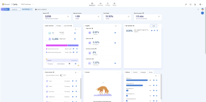
Microsoft Clarity
Microsoft Clarity is one of the most accessible heatmap and behavioural analytics tools available, largely because it is completely free to use. This makes it an excellent starting point for businesses that don’t yet have a qualitative data capture tool in place or want to explore user behaviour without an initial investment.
The platform provides a broad range of heatmap types, including click, scroll, move, and attention maps, allowing teams to understand not just where users interact, but how far they scroll and which areas of a page attract the most focus. Beyond heatmaps, Microsoft Clarity also tracks behavioural signals such as rage clicks, dead clicks, quick backs, and excessive scrolling. These insights are particularly valuable for identifying frustration, confusion, or UX friction that may be negatively impacting conversion rates.
One consideration when using Microsoft Clarity is performance. Because it captures a large volume of behavioural data, the tracking script can add some weight to a website’s codebase. On larger or more complex sites, this may have a small impact on page speed. For this reason, many CRO teams choose to use Clarity strategically, running it during specific analysis periods rather than continuously, so they can balance insight gathering with site performance.
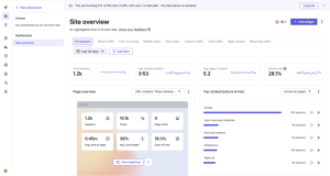
Hotjar
Hotjar is a widely used behaviour analytics platform that is particularly popular with CRO teams due to its strong performance and advanced analysis capabilities. Compared to some free alternatives, Hotjar’s tracking script is generally lighter, which means it tends to have less impact on site speed. This makes it a strong option for websites where performance is a key concern or where qualitative tracking needs to run more consistently.
One of Hotjar’s biggest strengths lies in its advanced filtering and segmentation features. These allow teams to analyse behaviour by traffic source, device type, user attributes, or specific page conditions, making it easier to isolate patterns and understand how different audience segments interact with a site. This level of granularity is especially valuable when diagnosing funnel drop-offs or evaluating the impact of specific marketing campaigns.
As a paid platform, Hotjar requires ongoing investment, but this cost is often justified by the depth of insight it provides. It also integrates seamlessly with CRO and A/B testing workflows, enabling teams to pair behavioural insights with experimentation. By using Hotjar alongside testing tools, businesses can validate hypotheses, monitor test behaviour, and ensure that design or UX changes are actually improving the user experience and conversion performance.
Other CRO tool stacks
Many A/B testing platforms also include built-in qualitative tracking, allowing heatmaps to run alongside experiments for deeper insight.
How to conduct a CRO heatmap analysis (step-by-step)
Step 1 – Define the goal or CRO hypothesis
Start with a clear objective, such as improving checkout completion, increasing CTA engagement, or reducing bounce rate on a landing page.
Step 2 – Select pages for analysis
- Prioritise high-traffic landing pages, key funnel and checkout pages, and any pages with high bounce rates or low conversion performance.
Step 3 – Set up heatmap tracking
Tool setup
- Install via Google Tag Manager or site code
- Connect to analytics platforms where possible
Traffic prerequisites
Most tools capture all pages by default, allowing filtering later.
Step 4 – Collect sufficient user data
Recommended sample sizes
A recommended minimum of around 1,000 users per page is recommended to achieve a reliable sample size, with larger data sets providing more accurate and dependable insights.
Timeframes
The required timeframe depends on overall traffic volume, but in most cases, heatmaps should be collected over a period of 30 to 90 days, and analysis should be avoided when sample sizes are too small to produce reliable insights.
Step 5 – Analyse the heatmap data
Look for ignored or “dead zones,” CTAs positioned below the fold, rage clicks and other confusion signals, excessive interaction with promo code fields, and any layout or hierarchy issues, then ask whether the page is behaving in the way users are actually expected to behave.
Step 6 – Document patterns and insights
Best practice includes capturing screenshots, documenting written observations, and tagging insights by themes such as UX, messaging, layout, trust, and user intent to ensure findings are clearly recorded and actionable.
Step 7 – Turn insights into optimisation actions
CRO ideas
- Move CTAs higher
- Add reassurance messaging
- Clarify pricing or delivery
- Reduce unnecessary interactions
A/B testing recommendations
Use heatmap insights to inform tests, not replace them.
Quick wins vs. high-impact experiments
Balance fast improvements with strategic experiments.
Best practices for ongoing conversion analysis
Update heatmaps before and after redesigns
Heatmaps should be used both before and after major website redesigns or layout changes to act as a behavioural benchmark. Reviewing heatmap data prior to a redesign helps teams understand how users currently interact with key elements, while post-launch heatmaps reveal whether those interactions have improved, shifted, or declined. This comparison makes it easier to validate design decisions and confirm whether changes have had a positive impact on user behaviour and conversion performance.
Combine heatmaps with other behaviour tools
While heatmaps provide powerful visual insight, they are most effective when used alongside other behavioural analysis tools. Combining heatmap data with analytics helps quantify performance, while session recordings add context to user actions. User testing can uncover motivations behind behaviour, and A/B testing allows teams to validate insights through experimentation. Together, these tools create a more complete and reliable picture of how users experience a website.
Monitor seasonal behaviour changes
User behaviour can vary significantly during peak trading periods, such as Black Friday or seasonal sales events. During these times, visitors may behave in ways that aren’trepresentative of typical customer journeys, often making faster or more impulsive decisions. For this reason, seasonal heatmap data should be interpreted with caution and compared against data from more “normal” periods before making long-term optimisation decisions.
Avoid relying on heatmaps alone
Although heatmaps are excellent for explaining why users behave in certain ways, they do not indicate how much that behaviour impacts performance. They should never be used in isolation. To ensure insights are accurate and actionable, heatmap findings should always be validated against quantitative data such as conversion rates, bounce rates, and funnel performance. This combination ensures optimisation decisions are based on both behavioural understanding and measurable outcomes.
Conclusion
CRO heatmap analysis plays a crucial role in understanding how users actually experience a website. By visualising real user behaviour, heatmaps make it easier to identify friction points, uncover user intent, and see which elements genuinely capture attention versus those that are overlooked. This insight strengthens CRO hypotheses by grounding them in behavioural evidence rather than assumptions, leading to more focused and effective optimisation strategies.
When used alongside analytics and experimentation, heatmaps significantly improve the effectiveness of A/B testing by highlighting where changes are most likely to have an impact. They also help teams prioritise UX and conversion improvements by revealing which issues are holding performance back and which opportunities offer the greatest potential return. Used iteratively and responsibly, heatmaps become one of the most powerful tools in a CRO toolkit, supporting continuous optimisation rather than one-off fixes.
At Modo25, heatmap analysis forms part of a structured CRO framework that combines qualitative insight, quantitative data, and rigorous experimentation. Ready to take your heatmap analysis to the next level? Explore our CRO services or get in touch with the Modo25 team to start optimising your site today.
